RSS Feed
Blog
Investigating and exploring things in the quilting and creative industries. I focus on the processes in batiks and using them in projects!
|
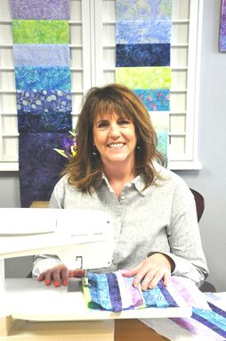
3/4/2021 0 Comments I'm in Quilty Box!
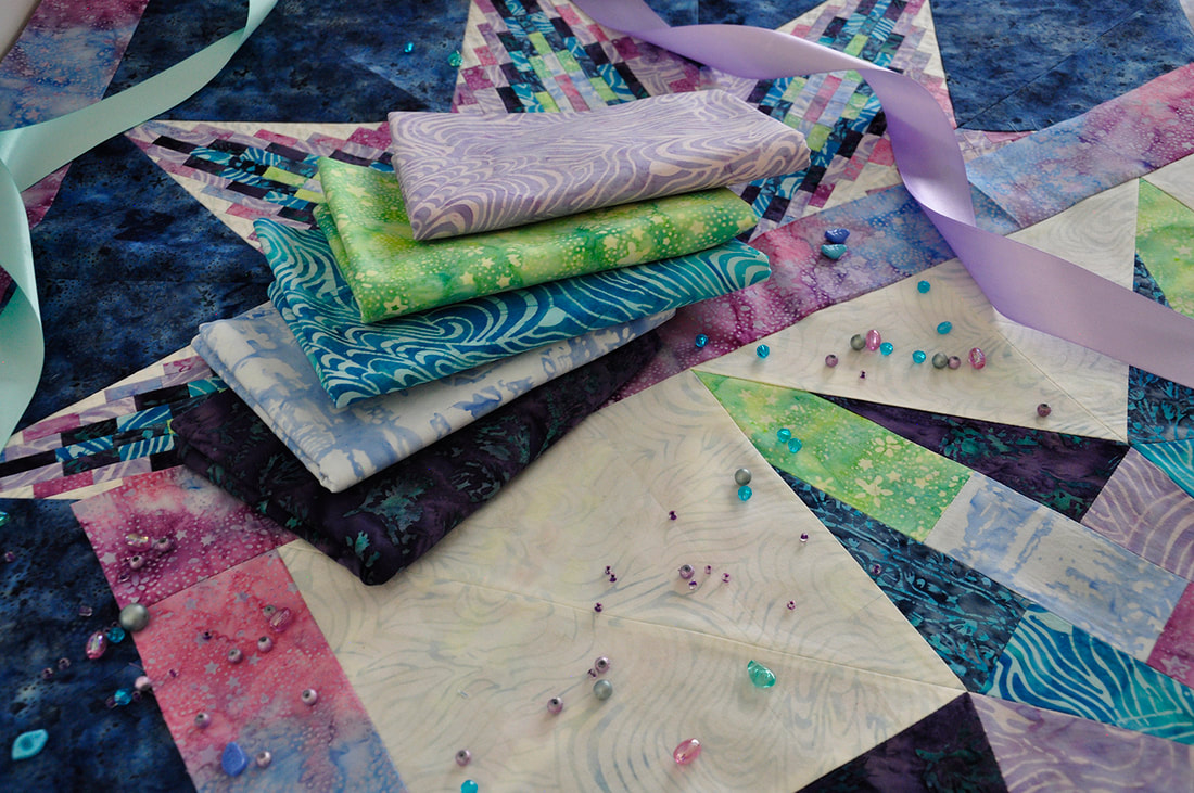
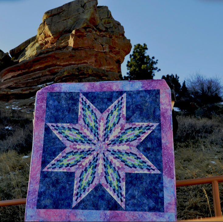
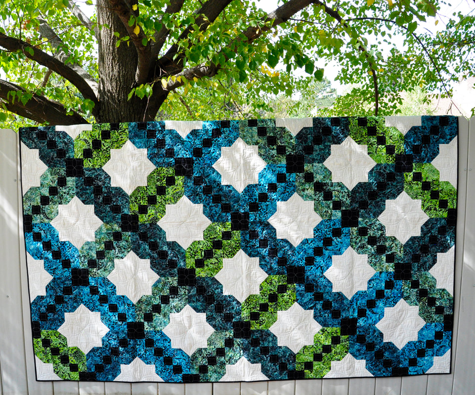
Doesn't this sound like fun?! Celebrate March being National Quilting Month and give this a try! Once you have the center diamonds finished, you get to go shopping, whether it be in your stash or at your favorite local quilt shop for setting and border fabrics! How cool is that?!
0 Comments
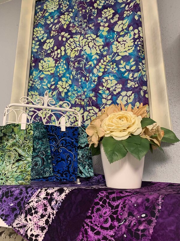
9/25/2020 0 Comments Focused on the Lustre Collection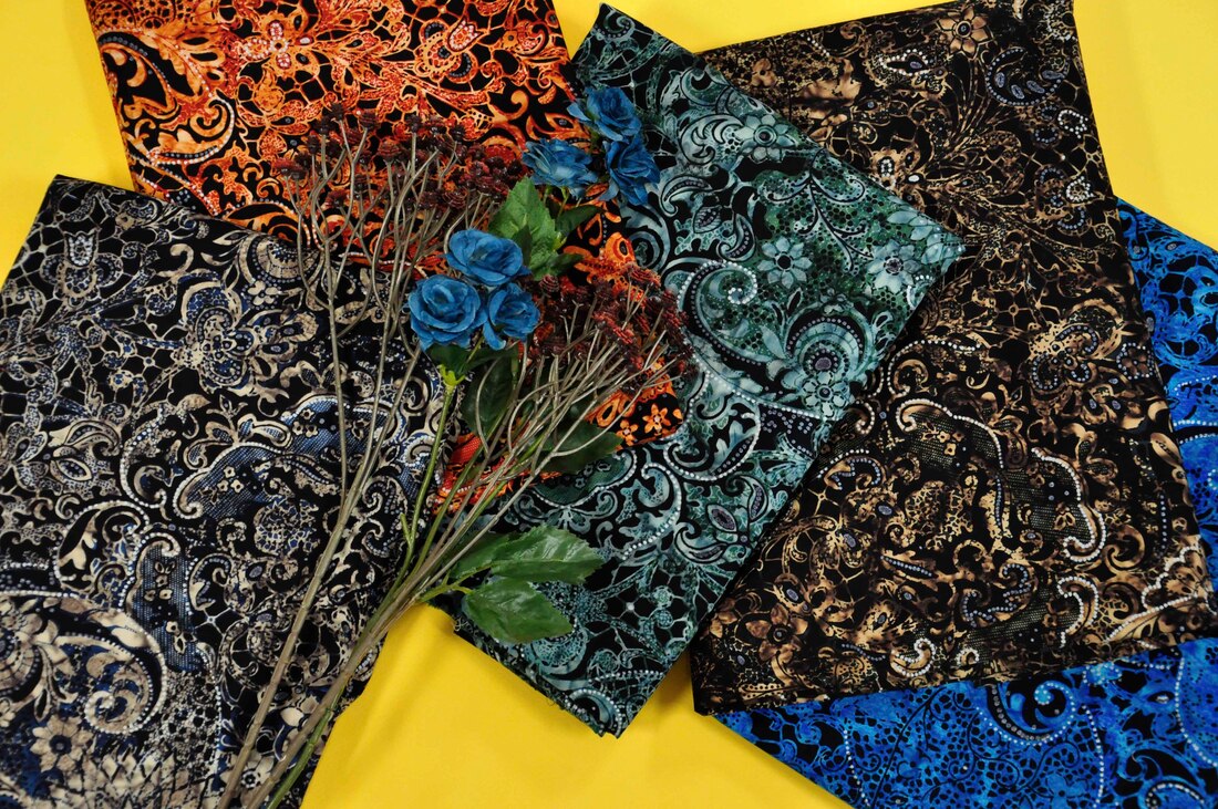 Let's talk Lustre! This unique batik is designed with a sophisticated elegance in mind. We love batiks because of their riot of color, the hand done quality that is achieved with them. When designing batiks, it becomes quite interesting trying to stay within the confines of the processes available but push for innovative results! Lustre is a prime example of achieving that difficult juggling act.
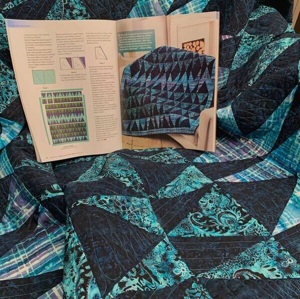
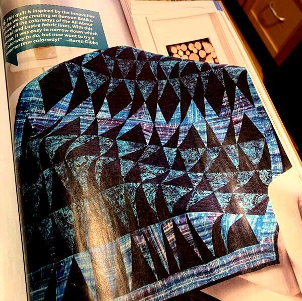
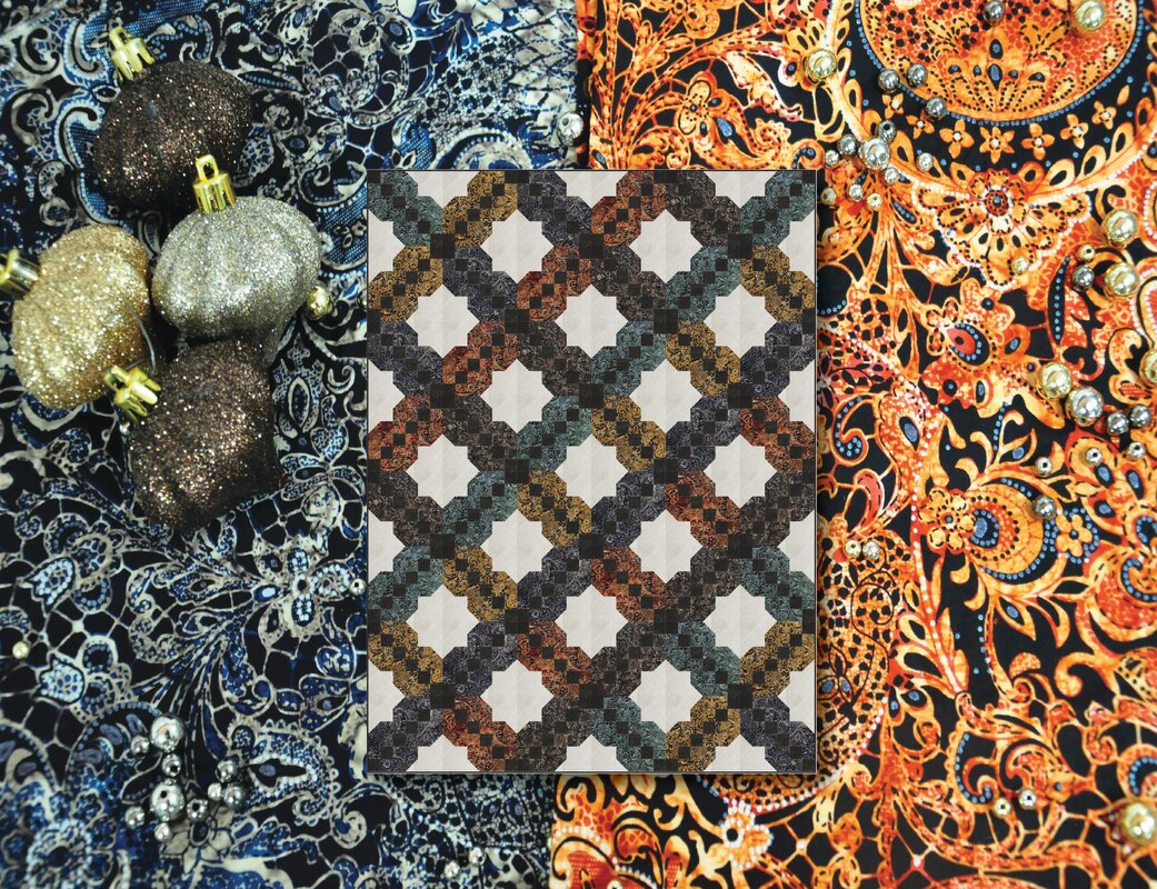 This fabulous coloration is with the new Lustre colors in the Earthtone palette. Tiffany's calling this version, Terra Gemma I've been so thrilled to have a few projects featured in publications lately! A couple of them were Lustre focused of course! I love the Loud Lipstick quilt project featured in Quiltmaker--link provided in the caption on the photo. This one features Lustre as the feature fabric. To offset it, I used the dark black ketan--it's got a little bit of navy in the motif--love it to offset those bright batik colors!
With a new palette of colors, I just had to play with a few projects! The first one is inspired by all those that planted gardens, growing tons of vegetables and are now trying to can everything! Jelly Jars are hard to come by in the grocery stores! Here's a quilt project to make showcasing our new love for this process!! There are multiple sizes in the pattern, there's some bargello if you'd like or even trapunto--all explained with lots of images--or just go and grab those beautiful Lustres and get canning! You can find the pattern at Quiltwoman.com. 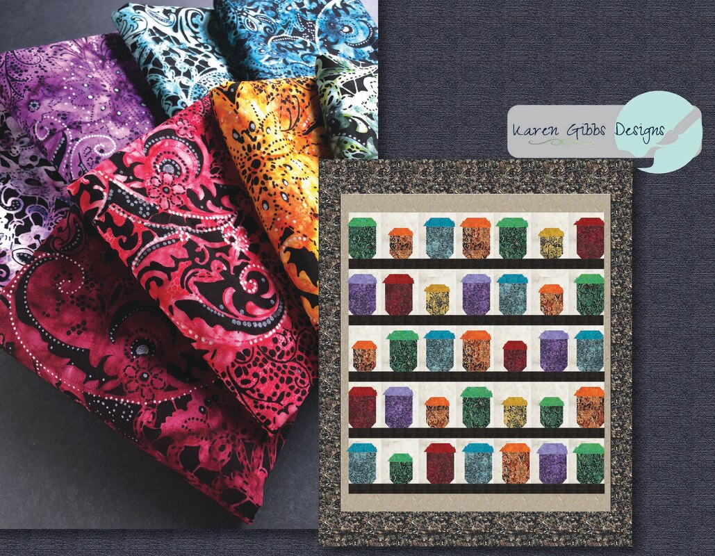
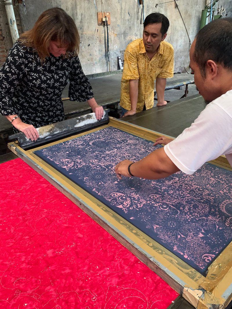
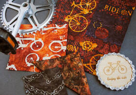
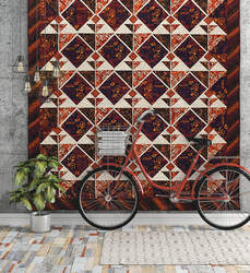
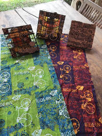 A collection of batiks starts for me, with the end use, what kind of project am I in the mood to work on. That isn’t where is always ends up though. There’s so much creative process inbetween, but to allow those twists and turns, to not be beholden to create that project that started it all….makes all the difference. I love pulling from different areas of inspiration. For this collection, I didn’t start as I normally do, with color. I started with the thought of creating a conversational collection in batiks, but fitting into a typical cotton collection type mold. A loose formula of a focal design, larger scale, maybe a border, definitely a texture, if I had a stripe or zigzag of some sort, that would be nice, and what about a smaller scale design and of course elements that make up my main source of inspiration. Lots of ideas going around in my head, but still in black and white. Sometimes, if I maintain the black and white for a while, the motifs and designs form faster. They’re not hindered or helped by riots of color but have to stand stark naked on their own. Is it just a line drawing, or is their areas of fill I want to think about? Because remember, the areas of black are what holds the wax in a batik. The motif color or line is put down first, the background washes over after a few more processes. The possible layering of these motifs then, to create a main design comes into play. The main design is actually three designs, created into three distinct tjaps that will be dipped in wax. Three different layers of color application, with depth of line vs fill, does the motif get lost, does the scale need to be adjusted? Can the scale of the bike be correct so to capture a little of the detail, but then take artistic license to have the feeling of tire imprint be a bit larger scale? What about the words? Is the font clear enough, spaced out enough in it’s shape of each letter so not to pool the wax when applied, so it’s legible? Is that too bold to put the name of the collection right there on the main design? Of course when designing a collection, I go into research mode. If you’re drawing something, it needs to be anatomically correct. Do I try and mix time eras? Do I mix styles of biking? I want the biggest audience of course, so I did choose to mix a few because at this point I started bringing in the thoughts of color palette. So many times with our projects, we can marry the craziest things with a cohesive color palette. So I brought in elements from my research: the retro bikes, the simple line drawings of the bike symbol—seen on street signs, made into bike racks even!—and my secret fav, the racers. 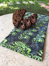 That actually was the hardest! How to take a pack of racers, basically bobble head them, eliminate all those arms and legs and bodies to create a pod, that looked like they were moving, there was a lot of them and you knew what it was. Add in the element of changing this drawing into copper for a tjap, and pooling of wax was definitely a thing! But then it was also directional! Do I repeat it so they’re upside down and sideways? Do I then lose the racing aspect of the thought behind it? Does that matter? I thought, yes, it does matter. As an end user, I think I would want those racers racing around my quilt, as a border. Ha! I created the border design! I chose to do a simple bike toss in the center and have the selvages for the border design. That way, it could be used in a few different ways. Let’s talk about my favorite texture design—Treads!! Love this! Instead of using a wax application, the colors are hand painted in diagonal stripes, then texturized to achieve that 3-D effect. It’s amazing to watch this process!! And know that each and every one of your batiks are hand made! 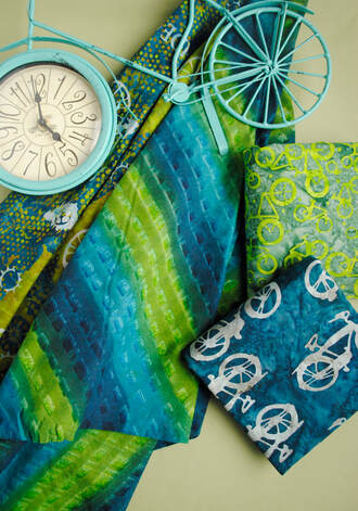 Choosing colors for this collection, finally!! This collection has been loved so much, I’ve been able to do two different releases with it, so a total of 5 colorways. While the first Ride On had three palettes, a blue/gray, coral/purple, brown/orange, I made sure the second release palettes were not duplicating those, but could work back with some of the colors. I think my favorite colorway is the burnt umber with the dark purple Indigo. Putting a shot of gold on that for contrast made it so rich. This colorway is featured in the quilt called Bike Tour, which you can find in the American Quilter magazine. I fussy cut the gold bikes out for the square on point blocks, so there is a definite direction to it. I added the little bit of relief from those deep and rich colors with the Ketan background neutral color. Had to show off that unique batik in the border. This is just so amazing to work with. The texture, so different. Gives the feels of bike treads, or marks on pavement when you have to break suddenly. I love seeing the process of making batiks. Each one is hand made and this one, treads, is quite unique. Click to watch the video and please make sure to leave a comment! |